How to Connect Rooms With Color
It also plays a significant role in the tone of the office. Connecting the rooms with color is an excellent way to create and maintain a professional workspace.
Why Is Color Important?
Whether color is used properly or not, it definitely sets the character of any space. Everyone knows the stark, almost overwhelming feeling of walking into a room (think first apartment) and seeing nothing but glaring white walls. It takes a practiced eye to visualize the difference color will make. It also takes a basic understanding of that good old color wheel you used in middle school art class. Pay attention to some main tips about color, otherwise you may end up with a choppy, disconnected space that screams chaos and discord.
Different colors, as well as different schemes of color, will create decidedly different feelings. Have you ever noticed that fast food restaurants tend to use bright colors like reds, oranges and yellows? These colors are stimulating and will tempt diners to hurry through their meals and leave. This opens the tables for more customers, which opens the business to more profits.
In the same vein, blues and greens tend to be relaxing colors and you’ll see them in spas and therapy offices. The visual impact of the room helps clients feel calm and relaxed.
What is a Color Scheme?
A color scheme is the overall design for how colors relate to each other. There are three basic color schemes:
- Monochromatic color. A monochromatic color scheme uses different shades of the same color to achieve unity as well as variety in an office or home. For example, navy blue, robin’s egg blue and periwinkle are all shades of blue and could be used throughout a space. Each room has its own shade, with a unifying color, usually white, on baseboards, moldings and trim. The monochromatic color scheme is a smart choice in many offices. There is a unified look all across the space, and also variety to separate areas visually.
- Complementary colors. Complementary colors are the colors found across from each other, or opposite, on a color wheel. Yellow and purple, red and green or blue and orange are sets of complementary colors. Complementary colors can bring balance if used properly.
- Analogous colors. Analogous colors sit next to each other on the color wheel. These colors can bring unity and harmony to a space, while still offering a wide variety of interest. Used with a bit of creativity, analogous color schemes can work well in your office.
What Else Do I Need to Know About Color?
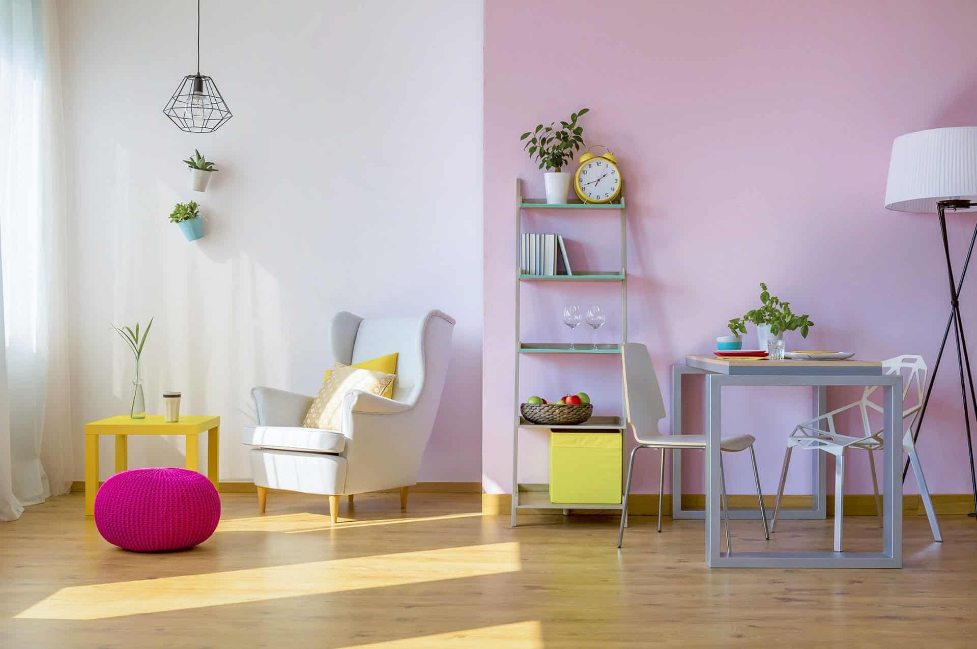
Accent, accent, accent. Knowing how to use accent colors can make the difference between your office looking fine, but boring, or it can create a focused, lively office dedicated to providing the best work possible.
The first thing to know about accent color is to make it bold. You can even use two colors, with one being primary and the other secondary. This is where your color scheme can pop.
Pillows, lamps, rugs and wall decor can make use of accent colors in an easy, comfortable way. Keep in mind one rule: repeat your accent color, but don’t overdo it. Usually, two or three pops of color in one area do the trick without overwhelming the eye. By using the same accent colors throughout the office, you bring a lighter element of harmony to the entire layout.
Choose Your Colors in the Right Place
Finally, when you are considering colors for your office space, don’t rely on your memory, those tiny paint chips under fluorescent lights in the store or even the opinions of others. The only way to really know what a color will look like in a specific place is to see it there and to see it in a larger quantity than a paint chip.
Think of that perfect yellow you saw in a magazine. A small paint chip of a bright yellow might look festive or energetic. Splashing that vibrant yellow across an entire room might send you racing for your sunglasses.
Colors look different in different lighting and in different quantities. Your best bet is to use a painted sample board a couple feet in length and width. Start with a white foundation color, if needed, and use two coats of your chosen color. Then you can hold the sample board up to the different walls in your room and see how the color really looks in your space.
Neutrals and Accents for Your Office
To achieve a professional, yet comfortable, color scheme for your offices, it’s probably best to start with a neutral and accent with color. Neutral doesn’t mean just black or white, but it does generally mean an understated hue of a median tone. You can choose from greys, browns, whites and even blues or greens, as long as they are muted and conservative. Then brighten up areas with accents and unifying white woodwork and trim and you’ll create an office space everyone can love.
